Calligraphy Practice Printable
Beautiful lettering starts with the same eight basic strokes, practised on good guidelines. This printable calligraphy pack gives you guideline sheets for upright brush lettering and slanted pointed-pen scripts in several sizes, plus stroke drill pages with grey strokes to trace — so you can build muscle memory before moving on to full letters and words.
- Instant download
- Editable Excel
- Print-ready PDF
- 7-day refund
9 files · PDF, XLSX
Calligraphy Practice Sheets
Printable calligraphy practice pack: basic stroke drill sheets, upright and slanted (55°) guideline sheets in three x-heights, italic 5° sheets and an Excel practice log.
- Stroke drills (PDF)
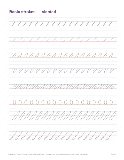
- Slanted stroke drills (PDF)
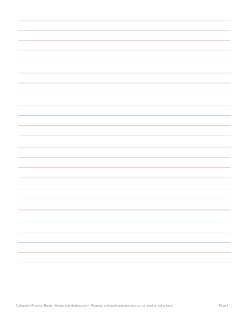
- Upright guidelines — large (PDF)
- + 6 more
$5.00 USD, one-time 9 files · about $0.56 each
- Instant download
- 7-day refund
- Secure checkout by Stripe
7-day money-back guarantee. Full refund within 7 days of purchase, even after you download.
Free sample: Basic Stroke Drills (PDF, 63 KB)
Calligraphy Practice Sheets
Printable calligraphy practice pack: basic stroke drill sheets, upright and slanted (55°) guideline sheets in three x-heights, italic 5° sheets and an Excel practice log.
- Stroke drills (PDF)
- Slanted stroke drills (PDF)
- Upright guidelines — large (PDF)
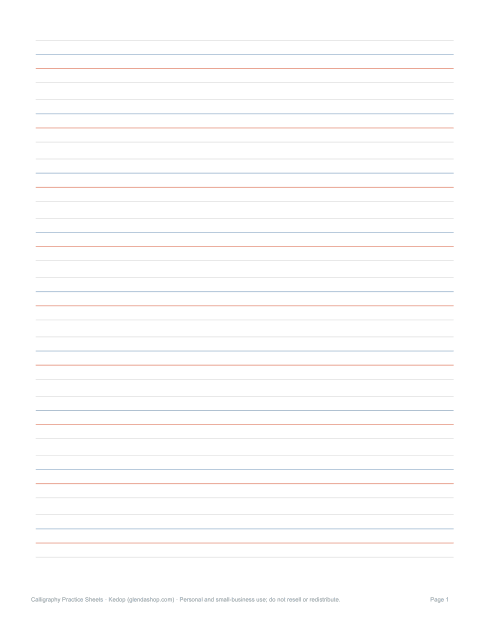
- Upright guidelines — medium (PDF)
- Upright guidelines — small (PDF)
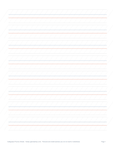
- 55° guidelines — medium (PDF)
- 55° guidelines — small (PDF)
- Italic 5° guidelines (PDF)
- Practice log (XLSX)
Formats: PDF, XLSX. Instant download after payment (link valid 72 hours, up to 5 downloads). AI-assisted: the templates were drafted with AI help and reviewed and laid out before publishing.
$5.00 USD, one-time 9 files · about $0.56 each
- Instant download
- 7-day refund
- Secure checkout by Stripe
7-day money-back guarantee. Full refund within 7 days of purchase, even after you download.
Free sample: Basic Stroke Drills (PDF, 63 KB)
Full refund within 7 days — see the refund policy and license.
Free printables
Single sheets you can print right now, no sign-up. The full pack adds every sheet in one download plus the editable files.
 Printable Calligraphy Stroke Drills1 page · free PDF
 Slanted Stroke Drills Printable1 page · free PDF
 Upright Calligraphy Practice Guidelines1 page · free PDF
 Free Upright Calligraphy Guide Sheet1 page · free PDF
 Printable Upright Calligraphy Guidelines1 page · free PDF
 Printable 55° Calligraphy Guidelines1 page · free PDF
 Printable 55° Small Calligraphy Guidelines1 page · free PDF
 Printable Italic 5° Guidelines1 page · free PDF
What is in the pack
| Sheet | Use |
|---|---|
| Basic stroke drills | Eight fundamental strokes to trace and copy |
| Upright guideline sheets | Brush pen and bouncy modern lettering |
| Slanted guideline sheets (55°) | Pointed-pen scripts such as Copperplate-style |
| Italic guidelines (5° slant) | Broad-edge italic hands |
| Large x-height sheets | Big brush pens and beginners |
| Small x-height sheets | Small brush pens and fine nibs |
| Practice log | Track daily drills |
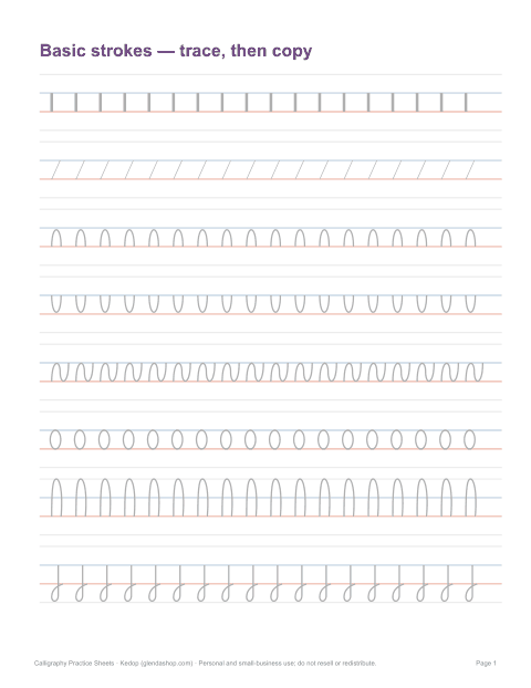
The eight basic strokes
- Downstroke — thick line pulled down with pressure.
- Upstroke — thin hairline pushed up with light pressure.
- Overturn — thin up, curve over, thick down (as in n, m).
- Underturn — thick down, curve under, thin up (as in u, i).
- Compound curve — overturn and underturn combined (as in n → u).
- Oval — the base of a, d, g, o, q.
- Ascending loop — tall loop above the x-height (b, d, h, k, l).
- Descending loop — loop below the baseline (g, j, y).
Almost every lowercase letter is built from these shapes, so drilling them is the fastest way to improve.
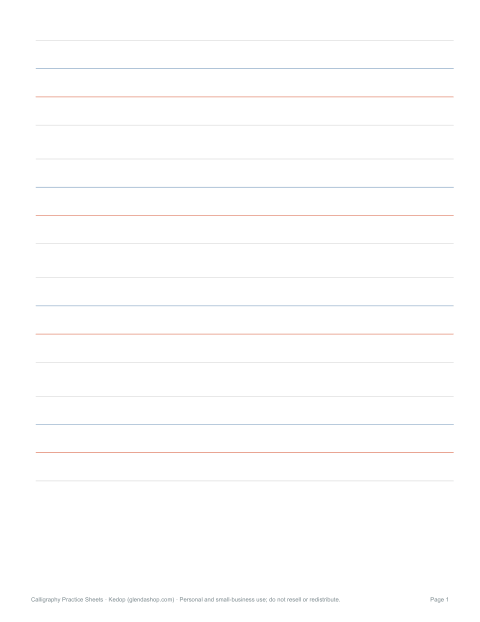
Reading the guidelines
| Line | Meaning |
|---|---|
| Baseline (red) | Where letters sit |
| X-height line (blue) | Top of lowercase letters such as a, n, o |
| Ascender line (top) | Top of tall letters (b, d, h, k, l) |
| Descender line (bottom) | Bottom of letters that drop below (g, j, p, y) |
| Slant lines | Keep the angle of downstrokes consistent |
The ratio of ascender : x-height : descender shapes the style. Modern brush lettering often uses roughly equal thirds; pointed-pen scripts use a small x-height with tall ascenders and long descenders.
Brush pen, pointed pen and faux calligraphy
- Brush pens — flexible tips; press for thick, release for thin. Start with a larger tip on the big x-height sheets.
- Pointed pen — a flexible nib in an oblique or straight holder with ink; pressure spreads the tines for thick strokes. Use the 55° slant sheets.
- Broad-edge (italic) — a chisel nib held at a constant angle; thick and thin come from direction, not pressure.
- Faux calligraphy — write with any pen, then thicken the downstrokes by drawing a second line and filling it in.
A daily practice routine
- Warm up for 5 minutes with ovals and slant lines.
- Drill two basic strokes for 5 minutes each, slowly.
- Practise three letters that use those strokes.
- Join them into short words.
- Finish by writing one quote or name.
- Note what improved in the practice log.
Slow, consistent strokes matter more than speed. Most beginners press too hard on upstrokes — keep them feather-light.
Choosing paper
Use smooth paper so brush tips and nibs don’t fray: laser printer paper around 90–120 gsm (24–32 lb) works well and is cheap enough for daily practice. Rough copy paper damages felt brush tips. For pointed pen, the ink must not feather — test a few strokes before a long session. Place a practice sheet under tracing paper or a thin marker pad to reuse guidelines.
Worked example
A beginner with a small-tip brush pen prints the stroke drill sheet and a medium x-height upright guideline sheet. They trace each grey stroke on the drill page, then copy the strokes on the blank rows, focusing on thin upstrokes and even downstroke angles. After a week of 15-minute sessions they move to letters a, d, g, o and q, which all start with the oval.
Common mistakes
- Pressing on upstrokes — they should be hairlines.
- Inconsistent slant — use the slant lines as a guide.
- Rushing curves — slow down at the turns.
- Writing letters at different heights — watch the x-height line.
- Holding the pen too upright with brush pens — angle it about 45°.
Formats
Print-ready PDF sheets (US Letter; A4 with “Fit to page”) and an Excel practice log. Print as many copies as you like for personal practice.
Frequently asked questions
What are calligraphy guidelines?
Printed lines that show the baseline, x-height, ascender and descender heights, and slant angle.
What slant is used for pointed-pen calligraphy?
About 55° from horizontal is typical for Copperplate-style scripts.
What pen should a beginner use?
A small or medium brush pen is easiest to start with.
What paper is best for brush pens?
Smooth paper such as laser printer paper around 90–120 gsm.
What are the basic strokes?
Downstroke, upstroke, overturn, underturn, compound curve, oval, ascending loop and descending loop.
Was AI used to create the sheets?
The sheets were generated by script and text drafted with AI assistance, then reviewed before publishing.